

On your website the call the action can have a big impact on your conversions, without clear call to actions it could mean website visitors leaving without taking any action.
It is important to clearly grab their attention in an impactful way that encourages them to take that next step towards your goal. That could be signing up to your newsletter, adding to cart or downloads.
There are different factors which will impact the success rate of call to action buttons, which will include the visual impact, compelling copy, positioning and justification to complete the action amongst other factors.
In our blog post we will look at the different types of call to action buttons, their purpose and best practices for creating effective CTAs which encourages visitors to take action immediately on your website.
Why You Need Call To Actions
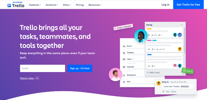
Call to action CTA buttons are an essential part of a website design, whether that be the homepage, landing page or content pages. They guide a visitor to quickly draw their attention to hopefully take immediate action.
It is great to have had potential customers arrive on your website, however without effective CTA it could result in lower conversions and missing out on potential opportunities unnecessarily. When deciding on what is the right call to action there are different CTA to consider.
This will depend on your goals for your marketing strategy which then will directly feed into either one CTA or it could be multiple CTAs. Here are some of the main purposes to consider as call to action examples for your goals:
- Sign up to newsletter
- Download a file e.g. document
- Add to cart for ECommerce site
- Video views
- Make an enquiry
- Free trial or Sign up to a package
If it is relevant to have multiple calls to action, then it is useful to review your marketing tactics to decide which would be the lead CTA and which are secondary CTAs. To help decide this it could be useful to review your sales funnel, marketing campaigns and marketing goals.
Standout and Visibility
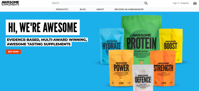
When looking at a few best practices it is important any call to action has high visibility and impactful standout. If you have been successful in getting potential customers to your website, you don’t want to be missing the opportunity to encourage them to take action.
With effective CTAs this can help to increase sales, with preventing bounce back to the search engine if website visitors didn’t find what they are after. They are some key elements that will help to encourage visitors to take further action.
This includes the colours, font, font size, CTA button size used and the placement. By using contrasting colours it can catch their attention amongst the rest of the page to notice the clickable button. Using white space around the Calls To Action can help to ensure it doesn’t get lost among the text. It helps to draw the eye.
When choosing the font and also the size, it is important to ensure it is clearly readable and that is for all device sizes such as mobile. Therefore it is worth testing this during the design process. If using the same font as the rest of the page, typography could be used such as bold to increase the standout.
It may seem obvious, but to increase the percentage of website visitors taking action then the CTA needs to be clear it is a clickable button. For example, an icon without contrasting colours could be mistaken for not being a CTA. There are various button sizes and shapes you could consider for your CTA buttons.
Compelling Calls To Action
It isn’t just about how the call to action looks on each page, compelling Call To Actions have impactful CTA text. Ideally it should be kept as a short phrase so it is simple to understand what action you want them to take. Therefore copy is recommended to be action orientated text.
As action examples the CTA copy could include action verbs and action words such as ‘try’, ‘download’, ‘book’ or ‘add’. Along with, if relevant, including time sensitive wording to encourage that desired action to be done straight away, such as including ‘now’ or ‘today’.
Putting this together, call to action examples could be ‘download your free ebook today’ or ‘sign up now and get 20% off today’.
When choosing the copy for your CTAS where possible write in your brand voice and the aim is to make it as simple as possible for visitors to take that specific action. There shouldn’t be any barriers to taking the action, and compelling call to actions typically have simple and short text.
Rationale To Take Action
Whilst keeping the CTA buttons simple and short, visitors to your website will also need to see rationale for why to take that action. This can be achieved with supporting text close to the call to action.
If wanting visitors to add an item to their cart for ECommerce conversions, including a star rating and reviews would give third party confidence that your product delivers the expected results.
Similarly if looking to increase downloads or video views, you could asks users who have used them to give your company a testimonial of how it helped them. Ideally if any stats can be included alongside, this helps to give a quick overview and justification on why to take that action on your website.
Aside to social proof, understanding the buying journey and from your sales person or team what the pain points are for your target audience, you could include supporting text on the web page of how your business can give the solution to that problem.
Providing the above avoids decision fatigue and achieves a well crafted call to action, which can help to increase the amount of actions taken due to giving them the relevant reassurance to use your company over your competitors.
Call To Action Positioning
Depending on if you have a main CTA or also using a secondary CTA the position of the call to action buttons is important. Not all visitors to your website will read an entire page, they may be trying to quickly see if you are the right company to solve their problem.
Therefore it is important as above the CTA stands out to visitors, and is seen before they leave the website. This can be shown above the fold to get their attention in case they haven’t scrolled further down your homepage or landing pages.
Typically a CTA button is shown in more than one place. The number of times will depend usually on the page length, for example a longer page it may suit to include also in the middle for those who will read additional information and at the bottom of the page.
When positioning the call to action, the main CTA button should have the highest standout so most definitely seen above the fold as this is where vital information is placed. With the second CTA or other CTAs seen further down the page for prospective customers.
As each webpage will differ in content, ensure to use a different CTA where needed to suit that information so it has clear CTAs relevant to that particular page and content. This will drive the best conversion for taking action.
Testing and Optimisation
Briefly touched on this above that for the best call to actions they need to be tested on different devices such as mobile and tablet and screen screens. To ensure they are clearly visible and impactful for all the ways it could be viewed by prospective customers.
Also every element of a CTA can be tested from the placement, colours, fonts and button style. Taking the time to test what a good CTA is with your target audience can have a big impact on the conversion rate for your call to action. Without testing, you could be missing out on getting the best from your call to actions.
How Can We Help?
We hope you found our blog post useful to learn more about some of the best practices for the call to actions on your website. Having effective CTAs can make a big impact on getting visitors to your website to click and complete a conversion.
Our team at 1PCS Creative are experienced at designing websites across multiple industries and sectors, giving us the right knowledge to achieve the best results for businesses. Please feel free to get in touch to see how we could help your business.
Ben Webster
Creative director at 1PCS. Addicted to design, SEO, pizza and helping companies big and small succeed online.