

At initial glance it may not seem that colours are that important. However colours actually say a great deal about your brand personality and directly impacts the user experience for visitors to your website.
It is worth taking the time to ensure the colours used represent your brand as you wish, as well as your products and services.
Colours are also a powerful tool when used correctly in contrast or to compliment one another to draw the visitors eyes to parts of the page that carry significance. Such as, call to actions to encourage conversions or an important promotional message.
Our blog post will look at why the colours you choose are important on your website. Along with providing advice and tips for using a colour palette in the best way to benefit your website, and increase brand awareness and recognition with your audience and customers.
Why do colours matter?
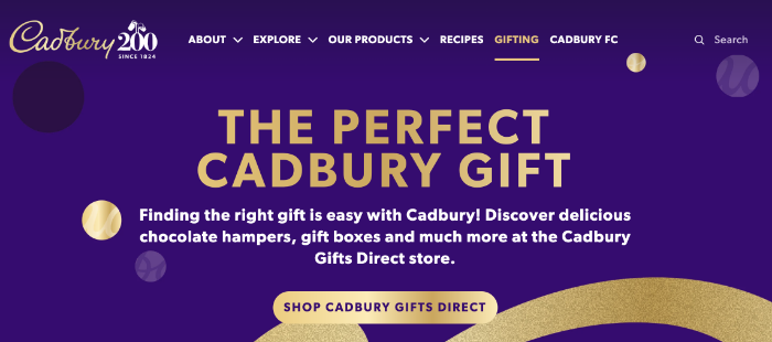
Brands can be instantly recognisable from their colours alone without even seeing their logo. This has been tested before in surveys with popular brands like Cadbury who are known for their use of dark purple for their brand colour.
Colours themselves carry their own meaning and emotion to your audience, so it is important to understand how your target audience view colours. A survey found that 85% of people had claimed colour was a major influence on what they bought.
With this in mind it is important to choose the right colours across all your marketing materials, including your website colours. With the colours chosen then used consistently for other forms of communication such as social media adverts, promotional materials and email marketing.
Colours form a huge part of a business’s branding along with other factors such as typefaces, logo, images and illustrations. Therefore, to ensure your website gives the right perception to your audience, getting the colours right is essential.
Brand Personality
When choosing your own website colours or colour themes it is recommended to understand the psychology and perception colours can have. By knowing this it will help to identify which colours best suit your brand personality, as well as the products and services that you offer.
A mistake businesses can make is picking colours based on their own personal favourite colours, rather than taking time to research into colours and what resonates with their audience and customers. Here are a few examples of the meanings behind colours:
Yellow: happiness and optimism
Red: Excitement and attention grabbing
Blue: Trustworthy and reassurance
Grey: Neutral and simplicity
Green: Nature and health
Orange: Friendly and joyful
Black: Premium and elegant
There are many more depending on the specific colour looking at and there are many studies and knowledge that can be learnt on the psychology behind colours.
Once have this knowledge it is then easy to see the logic behind colours chosen for well known brands. It will have been well thought out to the emotion and meaning behind each colour.
Upon deciding what your brand personality represents this then feeds into choosing the relevant colours for your website and how to use them.
Primary and Secondary Colours
First of all is choosing the right primary colour for your website. By having a primary colour this will be your main colour that is used. This should then follow with 1-2 secondary colours which is either a complementary colour or can be contrasting colours.
The reason for limiting the number of colours is to ensure any webpage on your website is not going to be too busy or cluttered. More colours would usually only be introduced for example to use additional icons or sections where it was relevant or needed.
The secondary colours also shouldn’t clash or be too drastic against the primary colour, as again this could impact visitors remaining on the website if they find it difficult to read or too cluttered.
Having more colours than just the initial primary colour allows for drawing attention to any important areas of focus on your website by helping to navigate visitors to a particular point using the secondary colours.
For example this would be call to actions to help increase conversions, to highlight an important point within your text or a promotional message.
When used correctly and to compliment one another, your colour palette is a powerful way to help visitors navigate on your website and have a positive user experience.

Background Colour
The background colour is the main colour used as the background on your webpages. It may be that your primary colour is too strong a colour for text to be readable or used on a large scale on the background. There are typically two routes which are popular for website colours on the background.
One being to use a more subtle shade of the primary colour across the website. Or alternatively to keep it simple and if suited to the brand using an off-white background, with the primary and secondary colours used around that background.
Other Factors
When choosing website colours it is also helpful at that stage to consider the typefaces likely to use on the website and across your branding. This is both the style and the colour.
Depending on chosen website brand colours it could be that having a black text clashes too much or is too difficult to read, therefore worth testing other shades.
Such as using a grey palette for your typeface can be an ideal solution to compliment the colours you have gone for. This can be easier to read and softer than using a dark shade for your typeface.
It is also worth considering and reviewing imagery and illustrations likely to use on the website to ensure the colours considering using will compliment the webpages. Each element should benefit the user experience for visitors, making it simple and easy to read, digest and navigate on your website.
Testing
To make sure you have the colours just right on your website that represent correctly your brand, it is essential to run testing. It could be looking initially at different shades or colour options to see how they perform.
Showing current customers, colleagues and friends is a great first step to get a sense for how the colours are received and the perception they have from the colours being tested.
This will help to see if your initial thinking and options are heading in the right direction. Once live you can also look at analytics for your website and see how it is performing to see if any changes or optimisation is needed.
It could be that the secondary colour isn’t quite performing as well as it could be for a particular call to action and so would benefit from further testing and changes.
Taking this time will help to give the best possible user experience on your website, to benefit how your business is perceived, recognised and ultimately the positive impact it will have on improving your conversions and enquiries.
How Can We Help?
We hope you found our blog post useful to understand the impact website colours have on your brand recognition and how your business is perceived by your audience and potential customers.
Choosing the right colours for your website will help to improve the user experience and help to benefit your business. With improved sales and enquiries when implemented correctly, along with other essential factors as part of delivering a successful and impactful website design.
At 1PCS Creative we have an experienced in-house design team and we come with over 20 years’ experience designing and building websites that are impactful and deliver results for our customers.
If you would like to discuss how we can help your business or review your current website, please feel free to get in touch with one of our friendly team.
Ben Webster
Creative director at 1PCS. Addicted to design, SEO, pizza and helping companies big and small succeed online.