

On your E-Commerce website the checkout process is vital to get right. The difference between an over-engineered long winded process and simple seamless process, can make a huge impact to the conversion rate and the level of cart abandonment.
When so much effort goes into the sales and marketing beforehand, it is a shame to lose out on customers at that final hurdle due to their frustrations at checkout, which can be caused for many different reasons.
Our blog post will look at some of the best practices which can be implemented into the checkout process to help make it a breeze for customers to place their order on your E-Commerce website.

Ben Webster
Creative director at 1PCS. Addicted to design, SEO, pizza and helping companies big and small succeed online.
Share This Article
Subscribe for updates
The Checkout Process
When referring to the checkout process this is the customer journey for their purchase process when online shopping. This process begins when they add items to the their cart right through to finalising their purchase.
The specific steps and methods to how the purchase process is complete on an ecommerce website can vary. For example it could be a single page checkout process or on multiple pages. The overall aim should be to have a great checkout page design that makes the process simple for the customer for the entire checkout process to prevent cart abandonment.
Typically the checkout flow would include within it:
- Add to cart
- Shipping information
- Billing details
- Payment method
- Order review
- Final confirmation
If your website doesn’t involve needing to be delivered such as a digital product, then the shipping stage wouldn’t be required as part of the checkout process.
Checkout Options
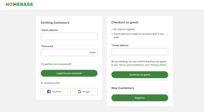
Once a visitor has added their items to the cart and want to proceed to the checkout page. The inclination might be forced account creation before go any further with their checkout. However this has been found to be a cause of cart abandonment.
Many new customers preferred method is often guest checkout. Having a guest checkout option allows them to quickly process their order quickly and easily with only providing the necessary information.
Another option is to offer social account sign in as a customer can be promptly verified and confirmed to proceed with their order, without needing a separate log in for each online store they use.
There is still benefit to account creation as customers can easily then track their order and view previous orders, along with it allowing for saving details to use next time. It also benefits an Ecommerce store with having the relevant details (with right permissions) for future marketing campaigns for cross selling and up selling.
However, this could be one of the options alongside the guest checkout and/or social account sign in for those who want it. Or alternatively offered as an option once the order has been placed, avoiding entirely the risk of cart abandonment by providing no initial barrier to the next step of the checkout process.
Mobile-Friendly Checkout Process
With it reported in a survey that 56% of online sales are completed on mobile devices, it shows the importance for online stores when looking at checkout designs to account for this. From mobile it needs to be user friendly to avoid potential customers leaving due to not having a positive experience.
This includes for example, any checkout pages accounting for finger size and smaller screens to give plenty of space for online shoppers to complete the entire process. Without accidentally entering their personal details into the wrong section or clicking a link they hadn’t wanted to, leading to them giving up and leaving the website.
Another addition to the checkout design which can be beneficial for mobile devices is including the option to be able to use their smartphone camera to scan payment cards, saving them time and effort entering their card details into their mobile.
Cart Summary
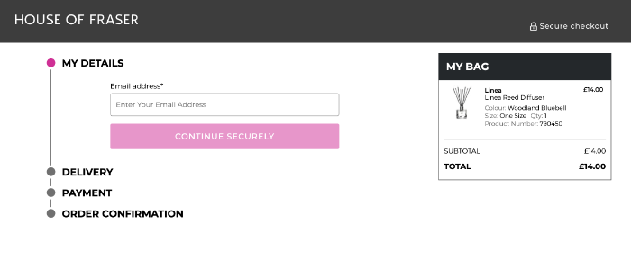
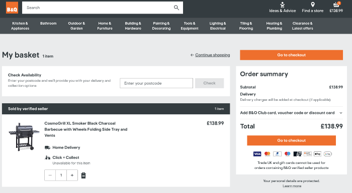
To avoid cart abandonment it helps to remind customers of what is in their cart throughout the checkout process with a cart summary. This would show for example the products in the their cart including the product name, quantity, colour, unit price and a total cost.
In doing so this will help keep a potential customer on the same page, rather than them potentially pressing back or navigating away from the checkout because they couldn’t quickly see what is in their basket.
This also easily allows them to simply amend their order throughout the buying process, not having to wait for the order review. Some of the best checkout pages also include a visual of the product(s) they are ordering to help with visual cues on their Ecommerce site.
Progress Indicator
Another part of best practice for the checkout pages is showing where a customer is on the buying process. For example they may currently be entering their shipping address, but a progress indicator could show then just have the payments page remaining to complete.
A progress bar is a useful feature to include in the checkout experience as it can quickly show customers that don’t have many steps left to fill in and reassures them of what point they are at in the process for their order. Therefore avoids them hitting the back button or losing interest if they feel too many steps to go and leave the site.
Avoid Errors
When customers are using an Ecommerce business they will likely experience different checkout pages from one website to another, and equally could be in a rush or not online savvy. Therefore, helping with simple error notifications is a best practice for the checkout page.
There are several ways in which the customer experience can be improved to ensure not losing out on conversions due to a customer not knowing how to fix an error. For example when an error message arises, it is helpful to show this in the relevant place the error is occurring, so it can be quickly fixed without the customer needing to hunt for it.
Another example is if part of the form validation is to complete compulsory information, such as post code. For each error to indicate in a simple and easy to understand way how t0 fix the error. E.g. ‘this is a required field’.
Trust Signals
Whilst a checkout process can have a great checkout page design and seamless to use when making a purchase. Another important best practice to implement is making sure visitors have the right reassurances. Shoppers will want to know it is safe for them to share their personal details such as billing address and payment information.
To build credibility with website visitors display trust signals. This could be customer testimonials as they are an effective way for website visitors to read about positive experiences your customers have had and assures them that orders have been placed and received successfully.
Display relevant logos such as payment logos like PayPal and Visa, along with including full details on the return policy on the E-Commerce website. This is another method which will help customers to feel safe and protected to proceed with their purchase on the checkout page.
Payment
There are a few things to consider as part of best practice for a checkout process when a customer is at the payment process stage. Firstly we would recommend if possible providing multiple payment options. In doing so this will mean you are accommodating as broader an audience as possible, as different customers will have different preferences for their payment method.
This could include PayPal, digital wallet such as Apple pay and Google pay which is ideal for mobile and a buy now, pay later option. Some payment options such as Visa allow for auto-fill once the username and password is entered. This saves time for the customer making it a better checkout experience and avoids input errors as not manually typed.
Another element to consider is ensuring visitors do not feel there are any hidden costs or unexpected costs which could lead to cart abandonment. It is best to be upfront early on in the checkout process or on your website of any additional fees. This may include shipping costs or taxes.
Discounts
With most customers after a bargain when online shopping, they may have coupon codes they wish to use when they hit the checkout button to go onto the payment page. However, if this is shown too visibly in the payment process, potential customers without a discount code may see this and feel they are missing out and leave the site to try and find a code.
This could end up with lost revenue if they don’t quickly find a code and leave their basket without completing their purchase. A solution to this is to show the coupon codes option slightly less visible such as a drop down option or less prominent. Those with a code will be on the lookout for it to add to their data validation when adding their payment details. However it avoids losing customers without a promo code.
We hope our blog post has helped to identify some best practices to improve the checkout experience for E-Commerce websites. This in turn can help to reduce cart abandonment and increase conversions.
We have over 20 years’ experience designing and building E-Commerce websites across many industries, therefore giving us the right knowledge and expertise to help.
Whether you need support with improving your existing online shop or considering a new E-Commerce website, please feel free to get in touch to discuss further with one of our team.