

It may sound simple but how website visitors navigate through your website as a result of your chosen website menu and your navigation structure, can be the difference between increased sales and time spent on your website to having a high bounce rate.
There are many menu options available when it comes to your website with pros and cons to each, along with top examples of when to use each menu design. In our blog post we will take a look at different menu designs you could choose from for your website’s structure.
First lets have a recap on what we mean when referring to the menu on websites and why good navigation is such an important element to your website design.
Ben Webster
Creative director at 1PCS. Addicted to design, SEO, pizza and helping companies big and small succeed online.
Share This Article
Subscribe for updates
Navigation Menus
When referring to website navigation this is how visitors move around your website to find what they are looking for. When web design uses good navigation a visitor may also use and find other pages useful on your website or go onto take an action which wasn’t part of their original search. A good example would be signing up to a newsletter.
As part of the navigation the menu design is what will help to guide them on the website. Visitors expect within just a few clicks to get to where they wanted with simplicity and ease. The golden rule when deciding on the menu bar is for it to be quick and hassle-free for both new and returning visitors to find what they want.
The menu should include important links such as ‘contact pages’, ‘products’, ‘about’ and ‘blog’. However this will differ for different companies depending on their audience needs. It is also important to consider mobile users, so how the website navigation bar will look both on desktop and mobile.
Website menu design done correctly will improve the user experience and most likely the time spent on the website. Which in turn can increase the actions taken, such as signing up to a newsletter, completing an enquiry form or making a purchase or higher basket value.
Not only this having simple and easy navigation can also benefit your search engine optimisation and reduces website bounce rates, which also impacts SEO.
Classic Horizontal Menus
Typically the menu design you would be used to seeing is a header menu which is horizontal across the top of the web page. This typically will have menu items of 1-2 words due to space and can vary of what is included on the menu. Usually it includes ‘contact us’, categories focused on for the business such as products/services and perhaps an ‘about’ or ‘blog’.
As part of the menu design when users hover over it may include rollovers such as a change in colour/font size to provide a bit of user interaction. Due to the limited space then this needs to be a simple menu without too many options. Therefore the most important links should be used for the options on the menu design.
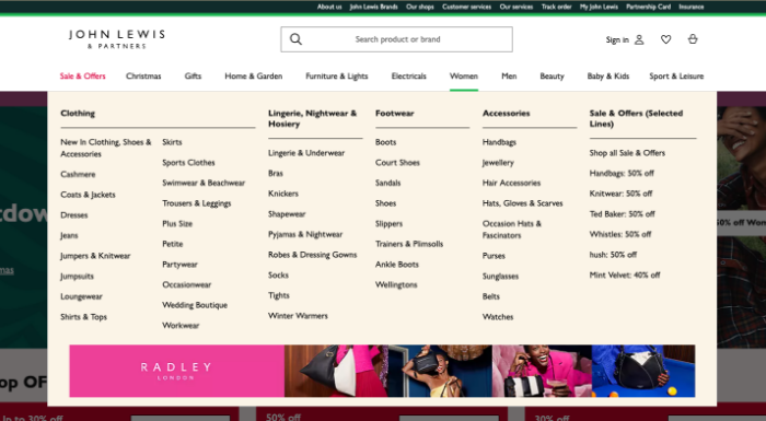
Mega Menu
Whilst the classic horizontal menus are popular, if you are an E-Commerce website, being restricted to the number of options means it could make it difficult for visitors to navigate easily on your website. For online retailers a mega menu is a great option.
A mega menu has the main categories on the primary navigation menu however when the mouse hovers over the options it will show more options. For example if a E-Commerce website offered clothing and the main option was ‘Women’ it may then list further product sub categories within that such as ‘tops’, ‘trousers’, ‘shoes’.
It is worth noting the menu design is important here so the dropdown menu is not cluttered and the style and design is intuitive. The last thing you want in trying to improve the user experience, is accidentally making the navigation bar more difficult for visitors.
Sidebar Menu
Another option which features more space for a higher amount of links to pages is a vertical sidebar navigation menu. This features usually on the left side of the homepage and due to being able to scroll then the benefit is more options can be listed, and also more words used for the options.
However the downside to this menu design whilst creating more options and links, it also takes up more design space. Therefore if images are a key element to your website, this menu design may not be the best option. It is typically used for E-Commerce websites or content heavy websites which need their site to include many links in the menu design.
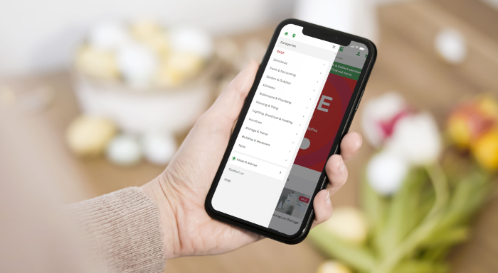
Hamburger Menu
The hamburger menu is the main option that was created with mobile users in mind to easily find what they are after on a website. The challenge with mobile for websites is the fact it is a much smaller screen size to desktop, therefore if the menu design is not responsive it can make it tricky for a visitor to access the web pages they want to.
This option is a hamburger icon which is three horizontal lines, the icon opens when hover over to then show the menu options to select from. Whilst ideal to be used for mobile to make the menu easily accessible where space is limited, it also can be used to give a clean design when used on desktop.
Most Important Links
There are other menu design options that could also be selected from, however the above provides the main ones you would typically see on websites. As part of choosing the menu design to create intuitive and easy to use navigation for visitors. It is important to correctly decide the right links to include in the menu.
This will vary from website to website, so is not a one size fits all solution. We recommend keeping your target audience in mind. Ways of knowing what will keep first time visitors and returning visitors on your website and not hitting the back button, include reviewing your Google Analytics and speaking to your audience to find out why they come to your website and how they use it.
This research will help to identify the best options to include within the menu design to help improve the user experience on your website.
How can we help?
We hope our blog post was helpful to learn about the different menu design options that can be chosen from and the importance of choosing the right options on the menu too. The menu is an important part of your website design as it will directly impact how easy and simple the website is to navigate.
With simple and clear navigation this will help to prevent a high bounce back rate and improve user experience, which could increase sales and actions taken on your website. Our team are experienced at designing websites with your target audience in mind. Please feel free to get in touch to see how we can help.